Serra Marangoz
← All work

Case study 05 · November 2026 · Concept · Mobile banking

Odakbank

A concept for a fictional digital bank’s money-transfer flow, designed around a question that comes up again and again in customer complaints: did the money actually arrive?

FintechUX researchUX writingDesign system
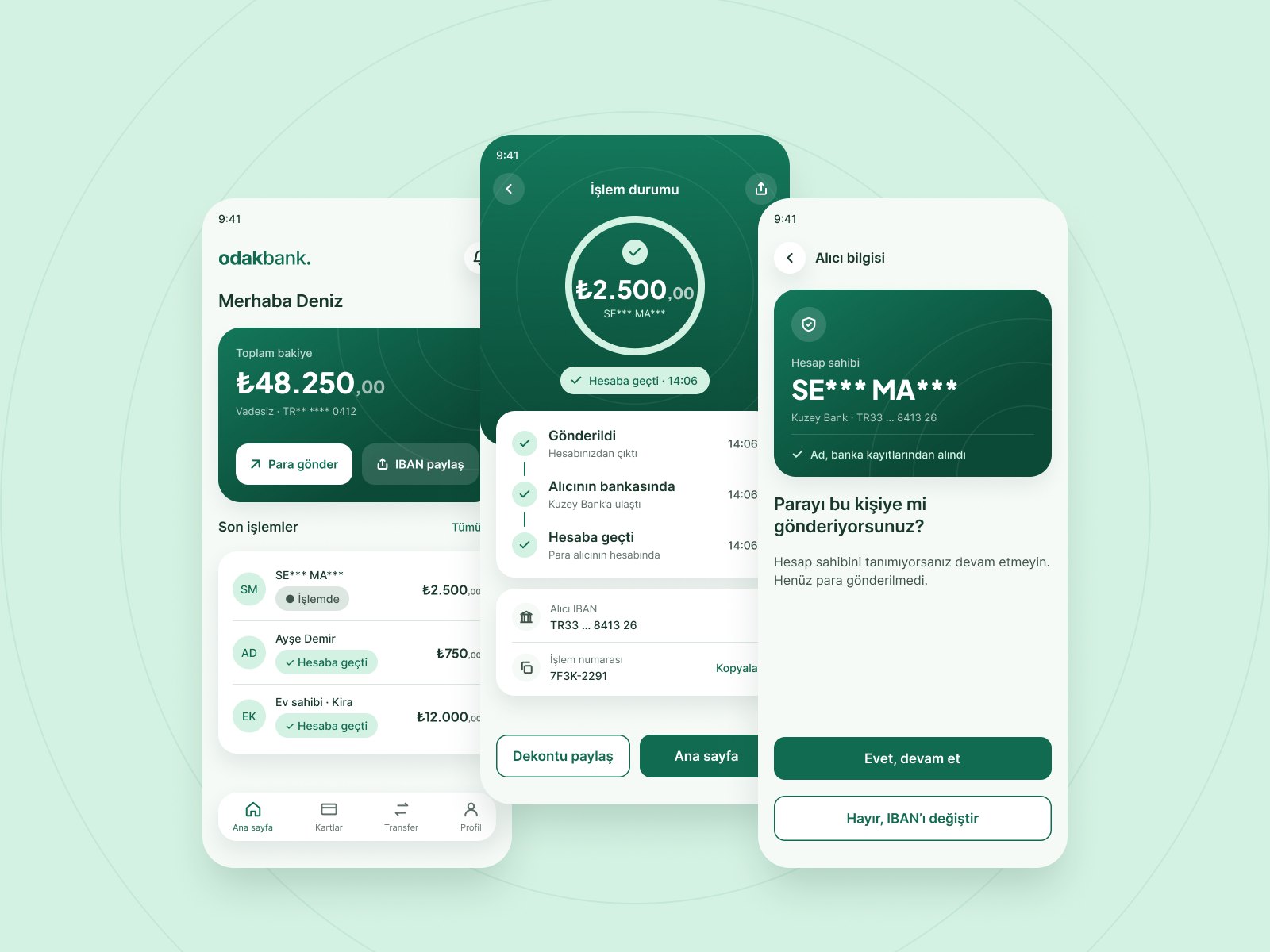
Odakbank home, transfer status and recipient check screens
Role
Solo designer, concept project
Scope
Transfer flow, 10 screens, design system
Evidence
50 public complaints, 19 banks and apps
Status
Usability testing planned

The problem

The interface is in Turkish; translations are in brackets.

01 · Observation

A success message isn’t always enough

Many banking apps end the transfer journey with a success message such as “İşlem başarılı” (Transaction successful). In the complaints I reviewed, this is often where the uncertainty begins: people wanted to know whether the money had reached the recipient.

02 · Insight

The experience should confirm the outcome of the transfer, not just the request.

31 of the 50 complaints reviewed described problems after the money was sent: unclear outcomes, error messages that didn’t explain what happened, and difficulty getting help.

03 · Goal

Make the transfer outcome clear inside the app

Show the latest confirmed status at each stage, explain failures in plain language and help people catch mistakes before they send.

What 50 complaints say

To explore post-transfer concerns, I analysed publicly available customer complaints.

I selected 50 money-transfer complaints posted on Şikâyetvar, a large Turkish public complaint platform, between November 2025 and November 2026, covering 19 banks and payment apps. I coded each one by journey stage (before, during or after sending) and assigned a single primary theme, so the categories are mutually exclusive.

31 after sending · 14 during · 5 before

Limitations. This is a purposive sample of people who chose to complain publicly, not a representative sample of mobile banking users. The findings highlight recurring pain points and were used to identify design opportunities, not to estimate how often these problems occur. The coding was done by one person, with AI assistance.
AI-simulated conversations. I also used five AI-simulated persona conversations to explore possible concerns and generate hypotheses. They were not treated as primary research or as evidence of real user behaviour. Ideas that came only from these simulations, such as amount typos, are marked as hypotheses to be tested.
  1. Sent, but the outcome was unclear15
  2. Name and IBAN mismatch not caught10
  3. Blocked, with an unclear message8
  4. Verification code didn’t arrive5
  5. Wrong IBAN, no way to reverse it4
  6. Money sent to a scammer4
  7. Unexpected fee4

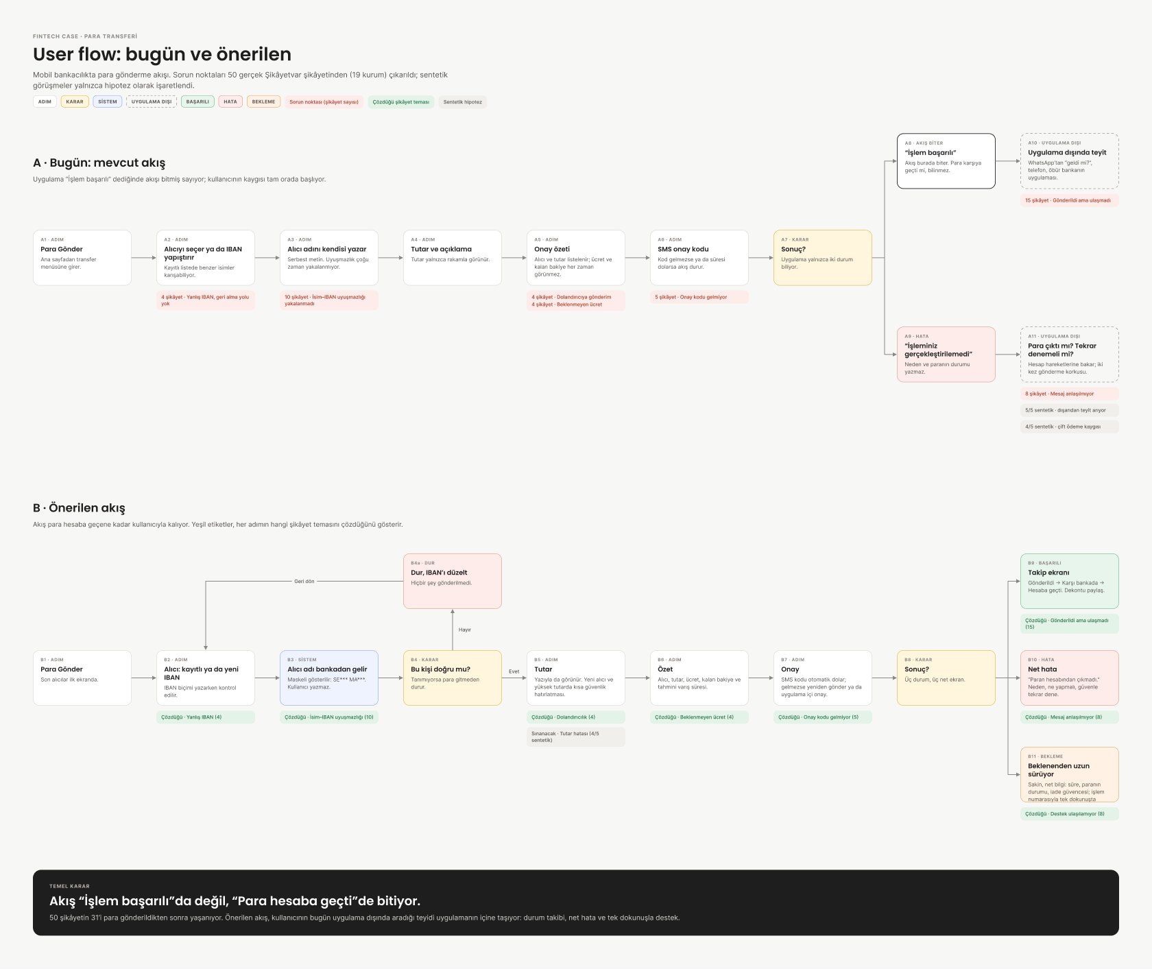
Current flow vs. proposed flow

Red tags show how many reviewed complaints relate to each step of a typical current flow (A). Green tags show which theme each proposed step addresses (B). Grey tags mark hypotheses from the AI-simulated conversations.

User flow: a typical current transfer flow compared with the proposed flow, annotated with complaint counts
Key decision: the proposed flow ends with a clear transfer outcome, not with the request being submitted.Open full size ↗

Key decisions

Each screen responds to a complaint theme. These are design concepts; the data they show depends on bank integration.

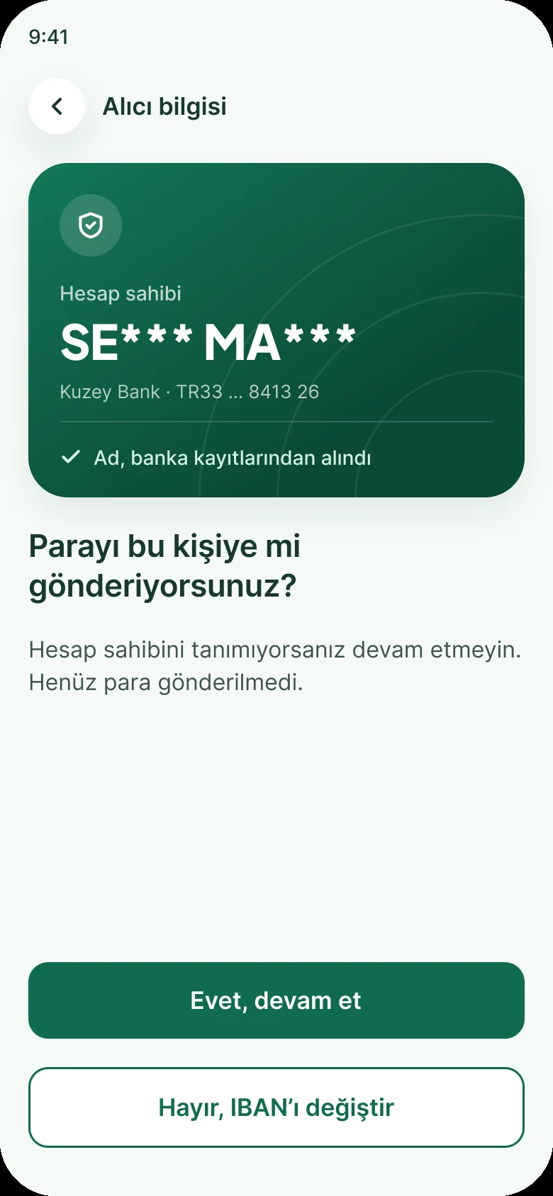
Helping users verify the recipient, Odakbank screen
10 complaints · name–IBAN mismatch

Helping users verify the recipient

Where supported, the flow shows bank-verified recipient details, such as a masked name, so users can confirm the payee before sending. Choosing “No” stops the flow before any money moves. Showing the name depends on bank integration and regulatory approval.

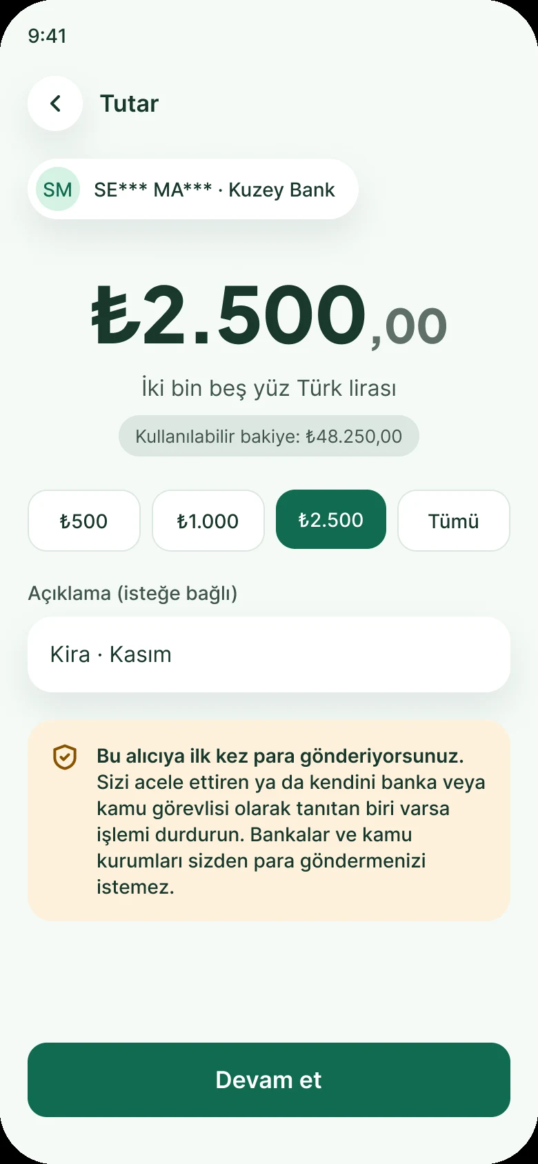
Safety guidance for new recipients, Odakbank screen
4 complaints · money sent to a scammer

Safety guidance for new recipients

The first time someone pays a new recipient, a short note describes a known fraud pattern: someone posing as bank staff or a public official and asking for a transfer. It supports the decision rather than preventing fraud, and stays off routine transfers to avoid warning fatigue.

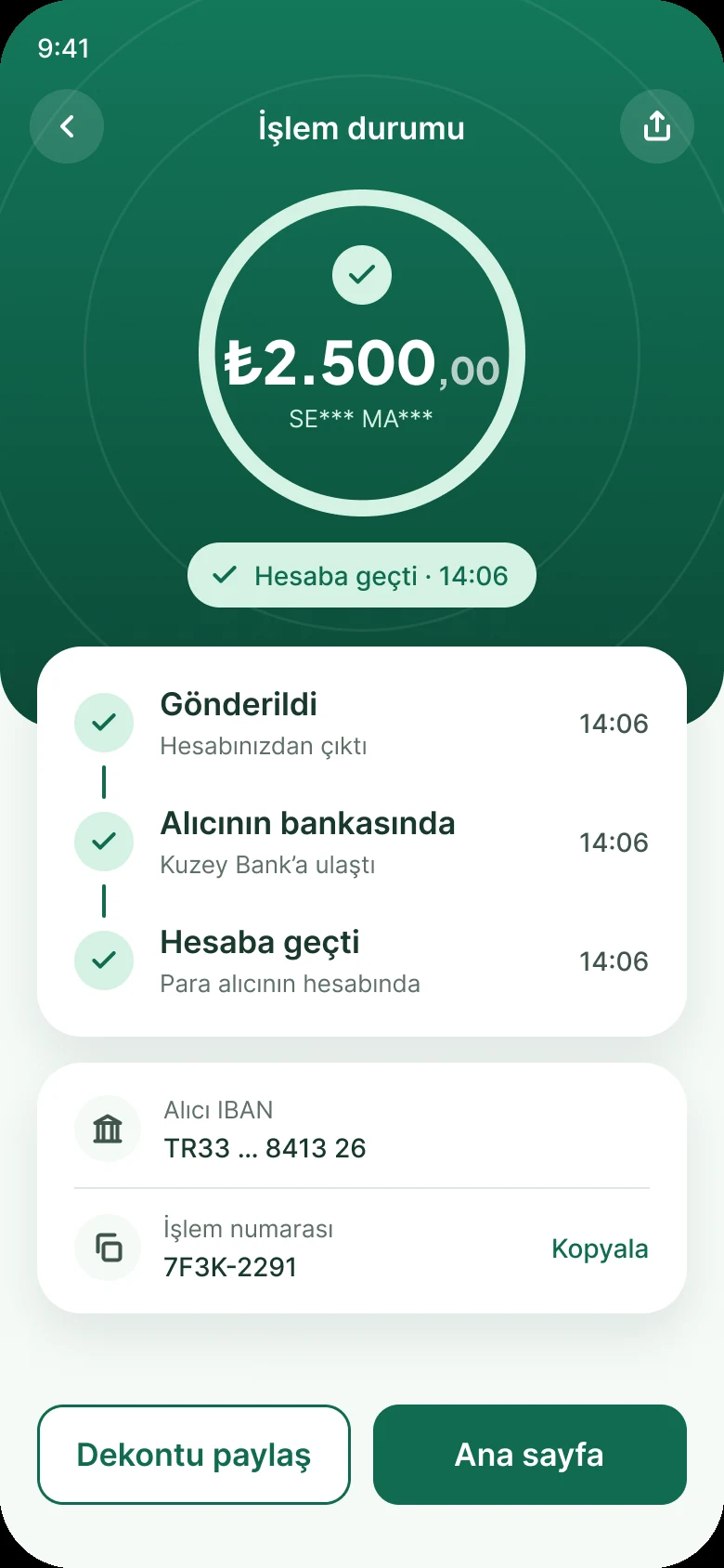
A clear, user-facing transfer status, Odakbank screen
15 complaints · outcome unclear

A clear, user-facing transfer status

The tracker turns available payment status updates into a simple timeline: processing, completed or unsuccessful. Intermediate steps and timestamps appear only if the bank and payment infrastructure provide those events. “Completed” means confirmed by the system, not checked by the recipient.

Lead with the confirmed status, Odakbank screen
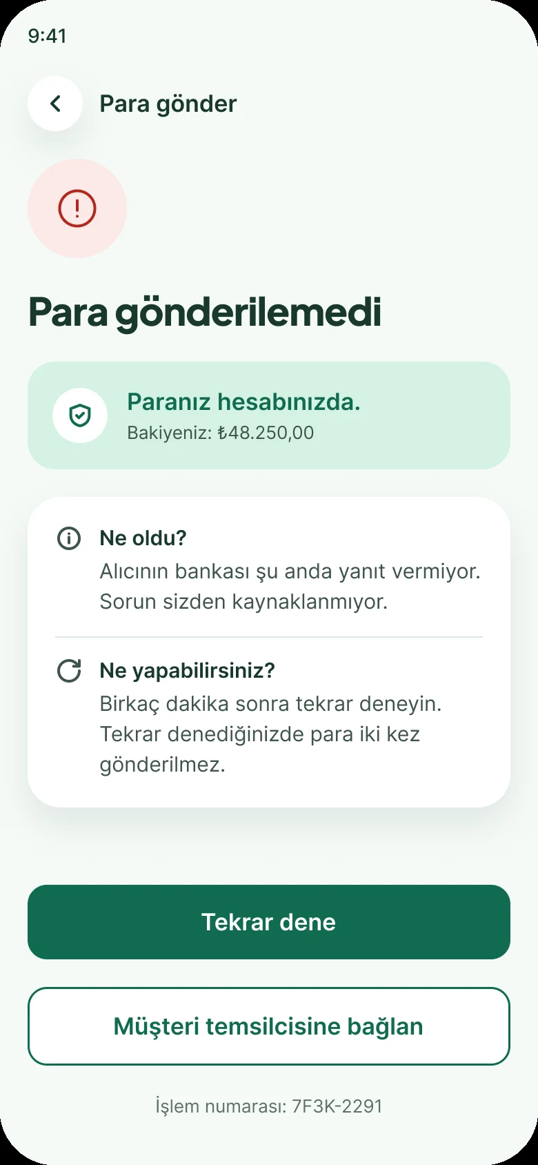
8 complaints · unclear error messages

Lead with the confirmed status

The first line states the latest confirmed status of the money, followed by what happened and what the user can do. Retry checks the original transaction’s status before allowing another attempt; duplicate-prevention safeguards need to be validated with engineering.

Smaller fixes, same idea

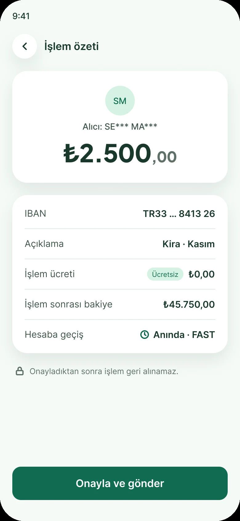
No surprises before confirming, Odakbank screen
4 complaints · unexpected fee

No surprises before confirming

The fee, the balance after the transfer and the processing method appear before the user confirms. “Anında · FAST” (Instant · FAST) in the mockup assumes the transfer is processed through FAST.

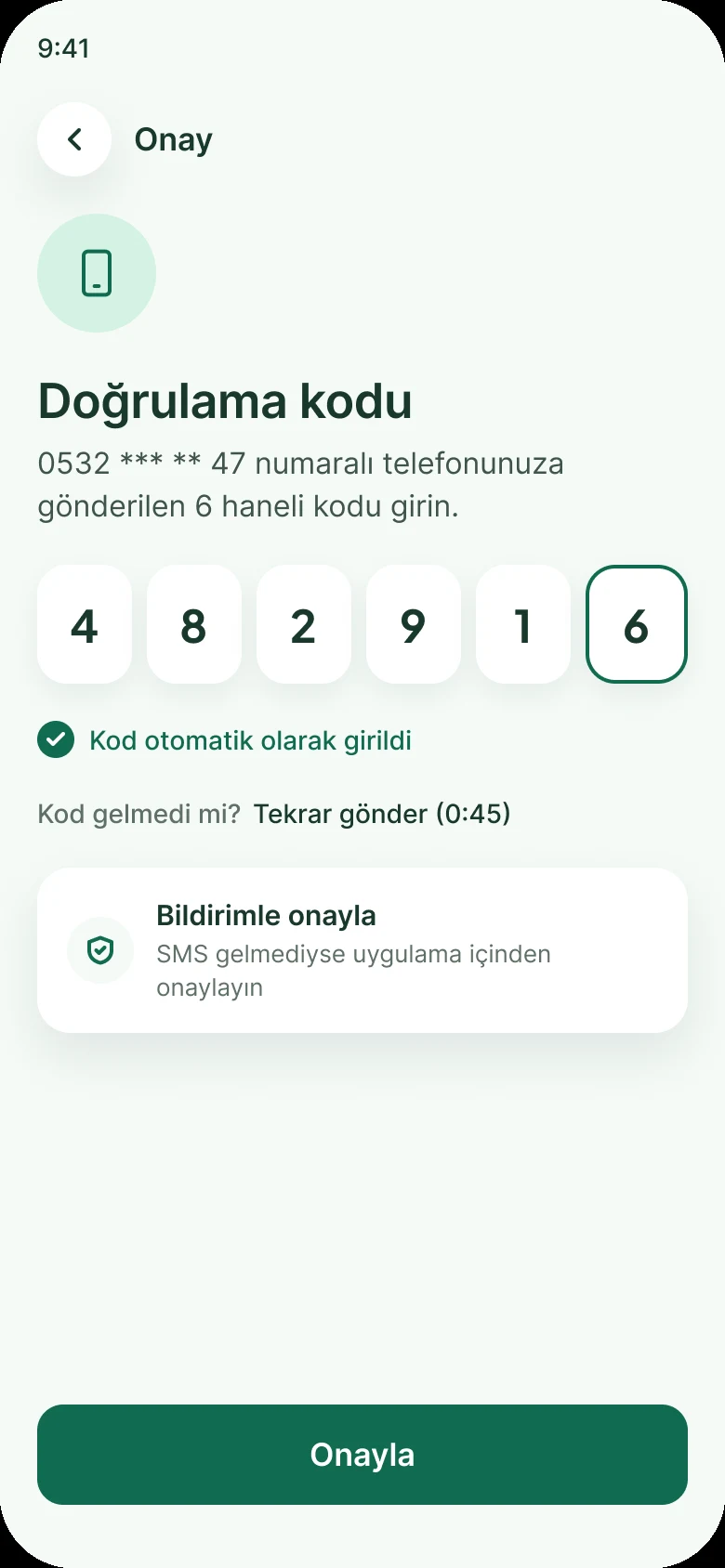
Options when the code doesn’t arrive, Odakbank screen
5 complaints · code didn’t arrive

Options when the code doesn’t arrive

SMS autofill and a visible resend timer. In-app approval is a concept that depends on whether regulation allows it alongside, or instead of, SMS confirmation.

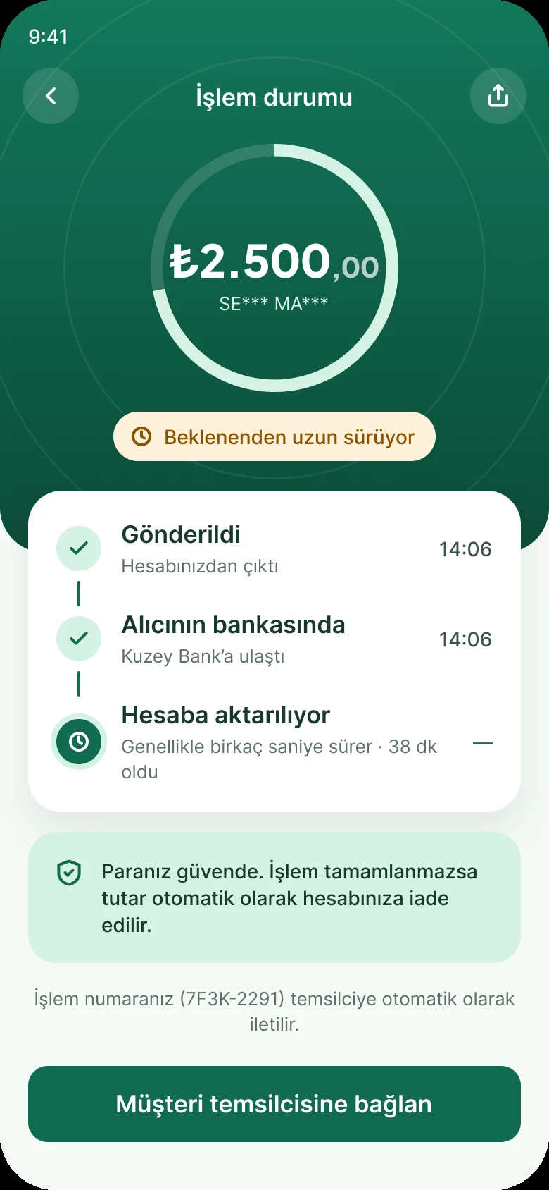
Calm guidance when a transfer is delayed, Odakbank screen
Edge case · delayed transfer

Calm guidance when a transfer is delayed

When a transfer takes longer than expected, the screen shows the latest confirmed status, how long it has been and what the user can do next, without promising an outcome the system hasn’t confirmed.

How it evolved

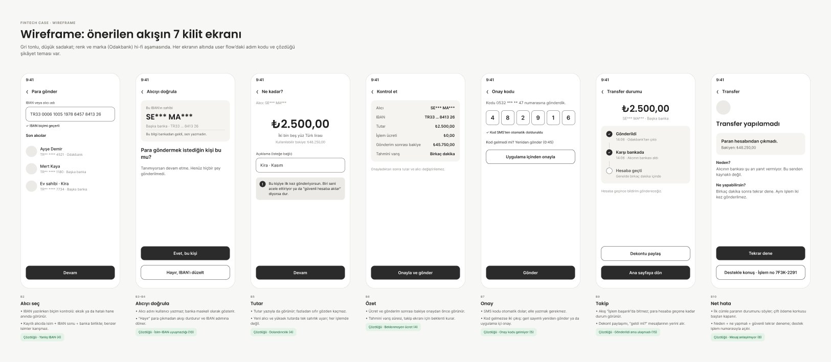
Structure before style
Step 1 · Wireframes

Structure before style

Seven greyscale screens, each linked to a step in the flow and the complaint theme it addresses, so every element had to justify its place.

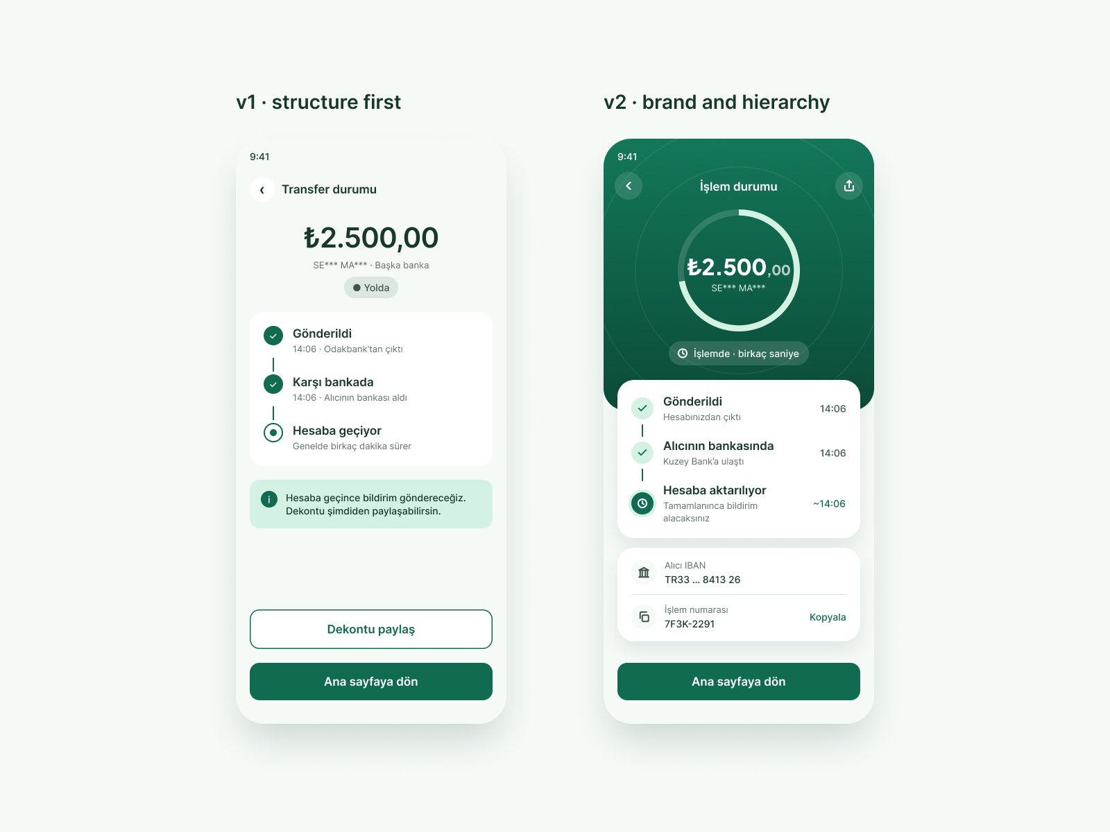
From correct to convincing
Step 2 · v1 → v2

From correct to convincing

v1 had the right flow but looked generic: text characters as icons, a single card style and no brand moment. v2 introduces a consistent icon set, a display typeface for amounts and more depth, and makes the status tracker the hero screen.

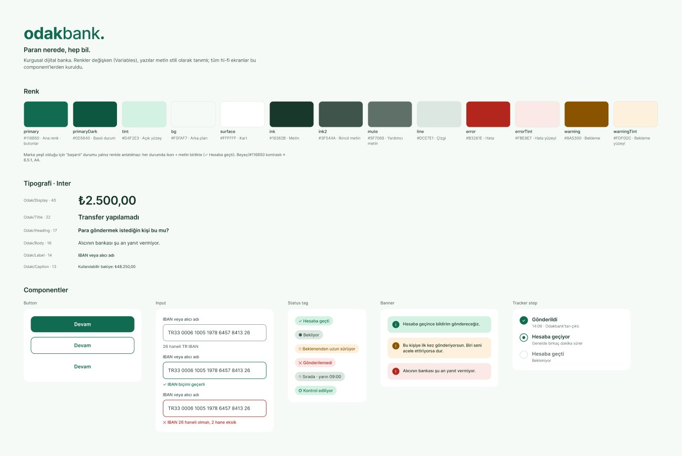
Built on tokens, not one-offs
Step 3 · Design system

Built on tokens, not one-offs

13 colour variables, 6 text styles and 5 component sets. Because the brand colour is green, success is never communicated by colour alone: every status pairs an icon with text.

Words matter

In a money app, wording can cause or ease anxiety. I reviewed every string for tone, accuracy and Turkish banking conventions.

The first version of the delayed-transfer screen said “Gecikiyor” (It’s delayed). Reading it as a user, I found it alarming, so I rewrote it and then reviewed the rest of the copy.

  • GecikiyorIt’s delayed
    Beklenenden uzun sürüyorTaking longer than usual

    “Delayed” suggests something has gone wrong. The new label describes what is happening without implying failure.

  • seninformal “you”
    sizformal “you”

    Turkish banks typically address customers formally. The informal voice felt too casual for a money app.

  • Bilgi alıcının bankasından geldiInfo came from the recipient’s bank
    Ad, banka kayıtlarından alındıName taken from bank records

    States what the information is and where it comes from: the user didn’t type this name.

  • Birkaç dakikaA few minutes
    Anında · FASTInstant · FAST

    FAST is a real-time payment system, so “a few minutes” set the wrong expectation. The label applies only to transfers processed through FAST.

  • Para isteRequest money
    IBAN paylaşShare IBAN

    “Asking for money” sounds blunt in Turkish. Sharing an IBAN correctly can also reduce wrong-IBAN mistakes on the recipient’s side.

The prototype

Start on the home screen and send ₺2.500. In the prototype, the tracker moves to “completed” automatically to show the intended interaction.

Loads from Figma. Works best on desktop.Open in Figma ↗

Next steps

Not done yet: what I would validate before handing this to a team.

  1. 01

    Moderated usability sessions

    Run 3–5 moderated sessions with the prototype. Test whether people understand what recipient verification confirms, how they read processing, completed and unsuccessful statuses, and what they do after a delay or error.

  2. 02

    Technical and regulatory checks

    Confirm with product and engineering which status events and timestamps can be shown, whether recipient names can be displayed and how duplicate transfers are prevented. Check whether in-app approval is permitted under BDDK rules.

  3. 03

    Limits and EFT

    Design alternative states for transfers above the FAST transaction limit and for EFT transfers initiated outside EFT processing hours, such as “Sırada · yarın 09:00” (Queued · tomorrow 09:00).

  4. 04

    The recipient’s side

    Design “IBAN paylaş” (Share IBAN) so the person receiving money can share a correct IBAN in one tap.