Pet health info lives everywhere, and nowhere.
Lost paper records, missed appointments and misinformation online make it hard for owners to make the right decision at the right time. Care gets delayed and owners feel anxious.
Case study 01 · April 2025 · Mobile app
An AI-powered pet care assistant that turns scattered health records and anxious guesswork into one calm, trusted place.
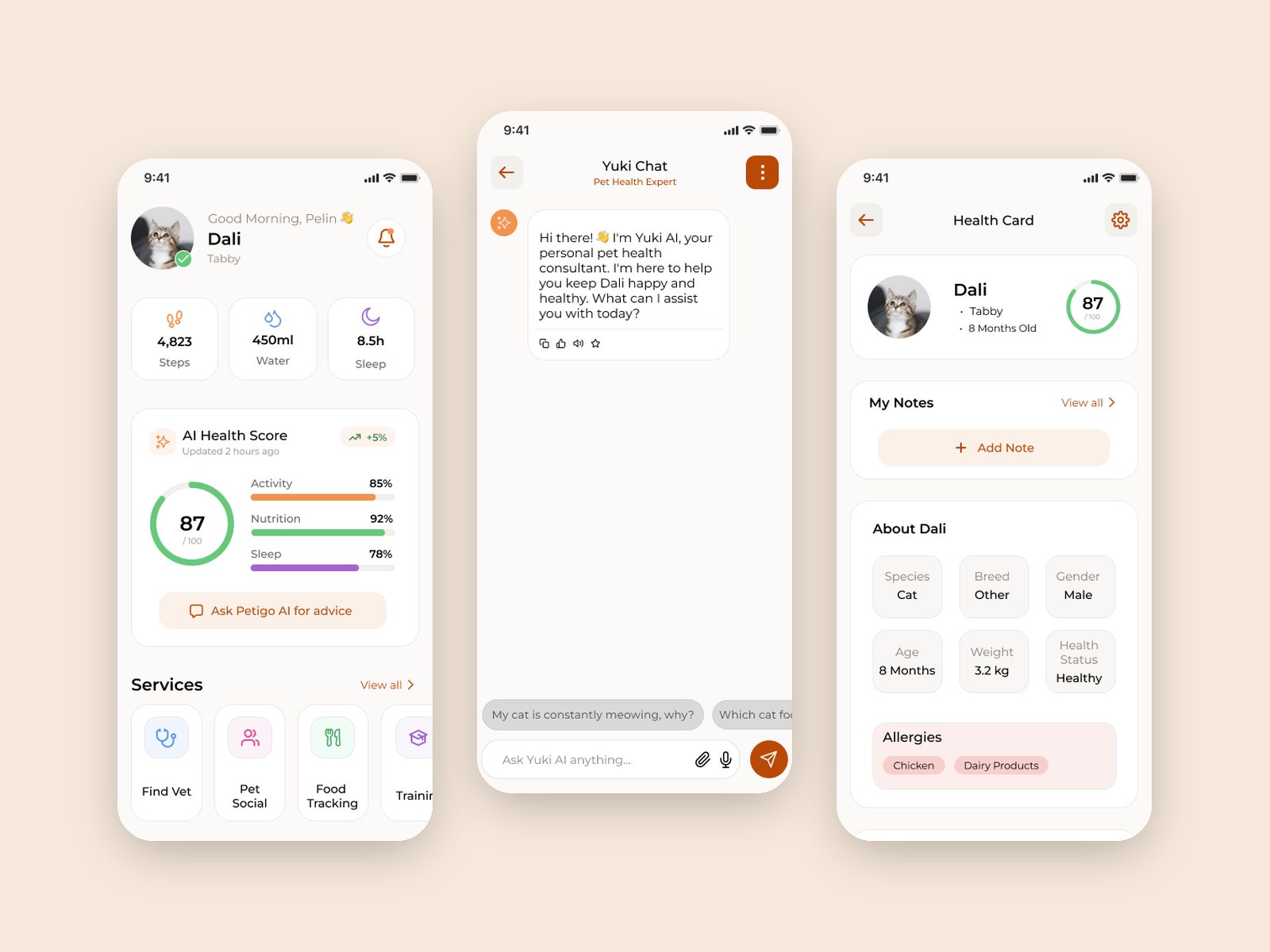
Lost paper records, missed appointments and misinformation online make it hard for owners to make the right decision at the right time. Care gets delayed and owners feel anxious.
Interviews with vets showed that missed reminders were the symptom. The root cause was the lack of a standard format for a pet’s health history, so the Digital Health Record became the priority.
Reduce cognitive load in anxious moments: one health record, smart reminders, an AI assistant and quick access to vets.
To test my assumptions, I talked to pet owners and to vets, the other key people in pet care.
I ran 35–40 minute interviews, online and face to face, with 6 pet owners and 2 veterinarians. The target audience was tech-savvy pet owners aged 25–45. I also benchmarked four local and global pet-care apps: Me Pety, My Pet, Pet Care and Digi Tail.
Owners are overwhelmed by conflicting advice online. Filtering for accurate information increases anxiety.
New owners want professional advice even for small issues. Not reaching an expert triggers stress.
Managing care alone makes small emergencies feel like panic.
Tracking vaccines, medication and appointments in a busy routine creates a constant fear of forgetting.
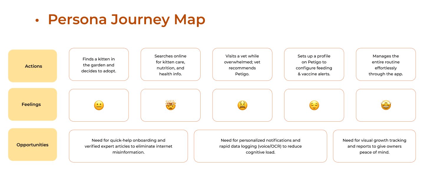
Pelin, the persona built from the interviews, finds a kitten, searches online, visits a vet and finally settles into a routine. Each stage pointed to an opportunity.
Every screen answers a pain point from research.
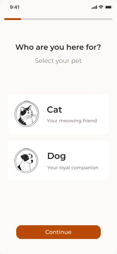
One question per screen. Breed, age and needs filter content from day one.
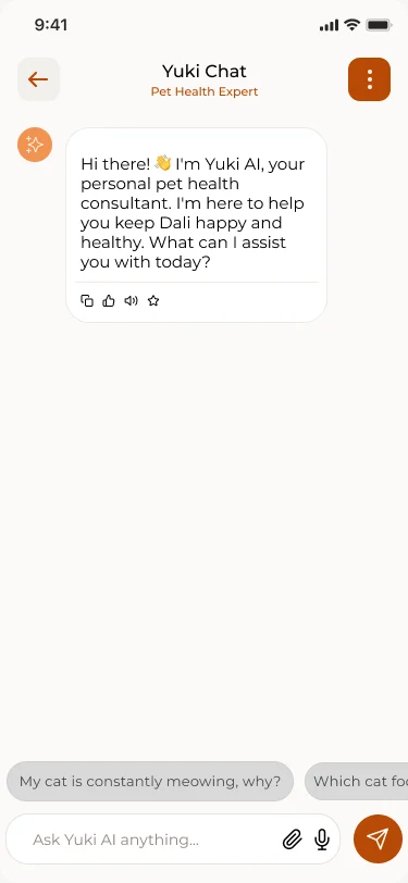
24/7 guidance with quick-reply chips: vet advice in bite-sized steps.
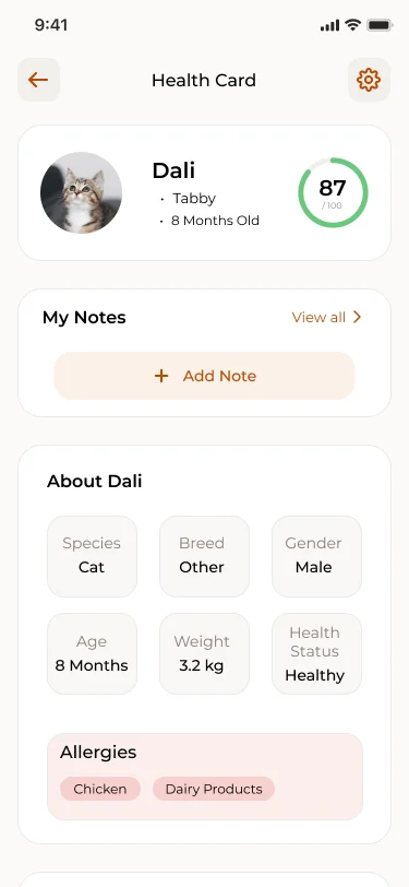
Vaccines and history in one card: the standard record vets asked for.
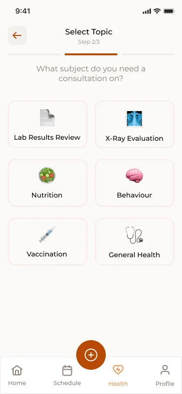
Topic, then vet, then time slot: booking designed to take under 3 taps.
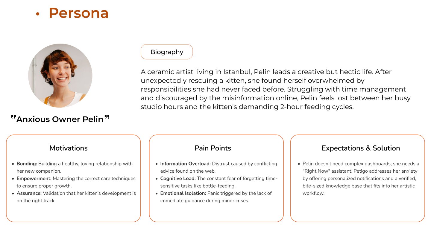
A ceramic artist in Istanbul who unexpectedly rescues a kitten. She doesn’t need a complex dashboard; she needs a “right now” assistant.
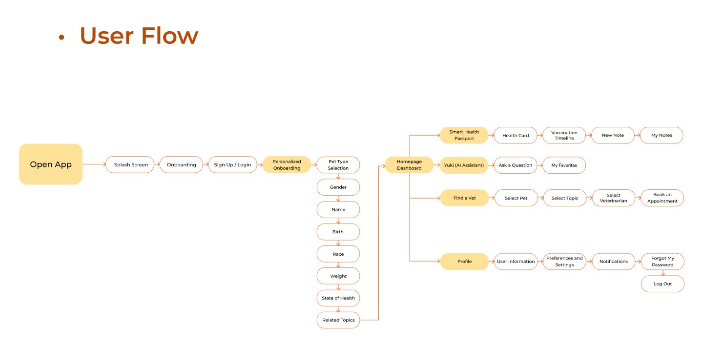
Personalised onboarding leads to a home dashboard with four branches: Smart Health Passport, Yuki, Find a Vet and Profile.
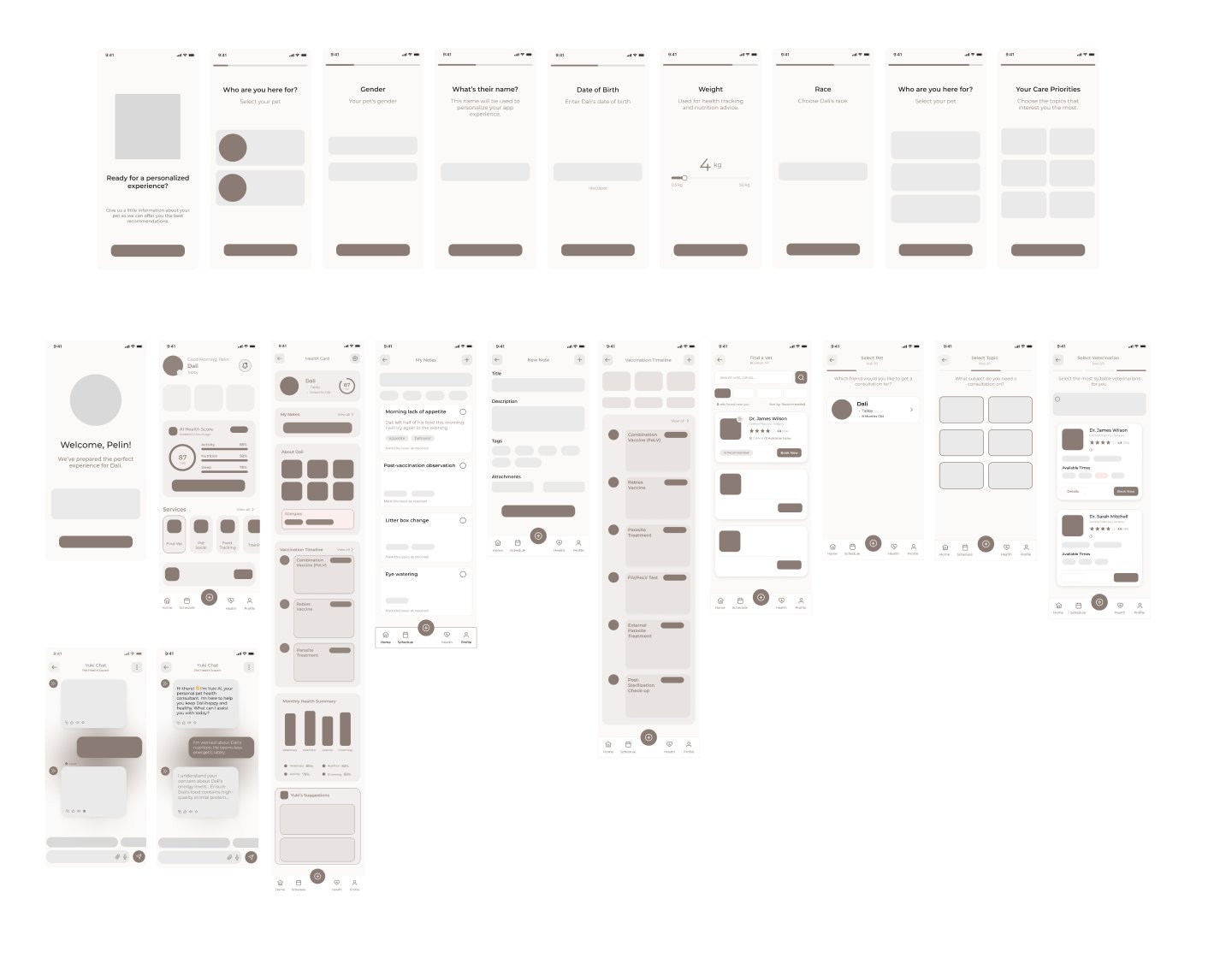
Greyscale screens for onboarding, the health card, notes and vet booking, before any visual styling.
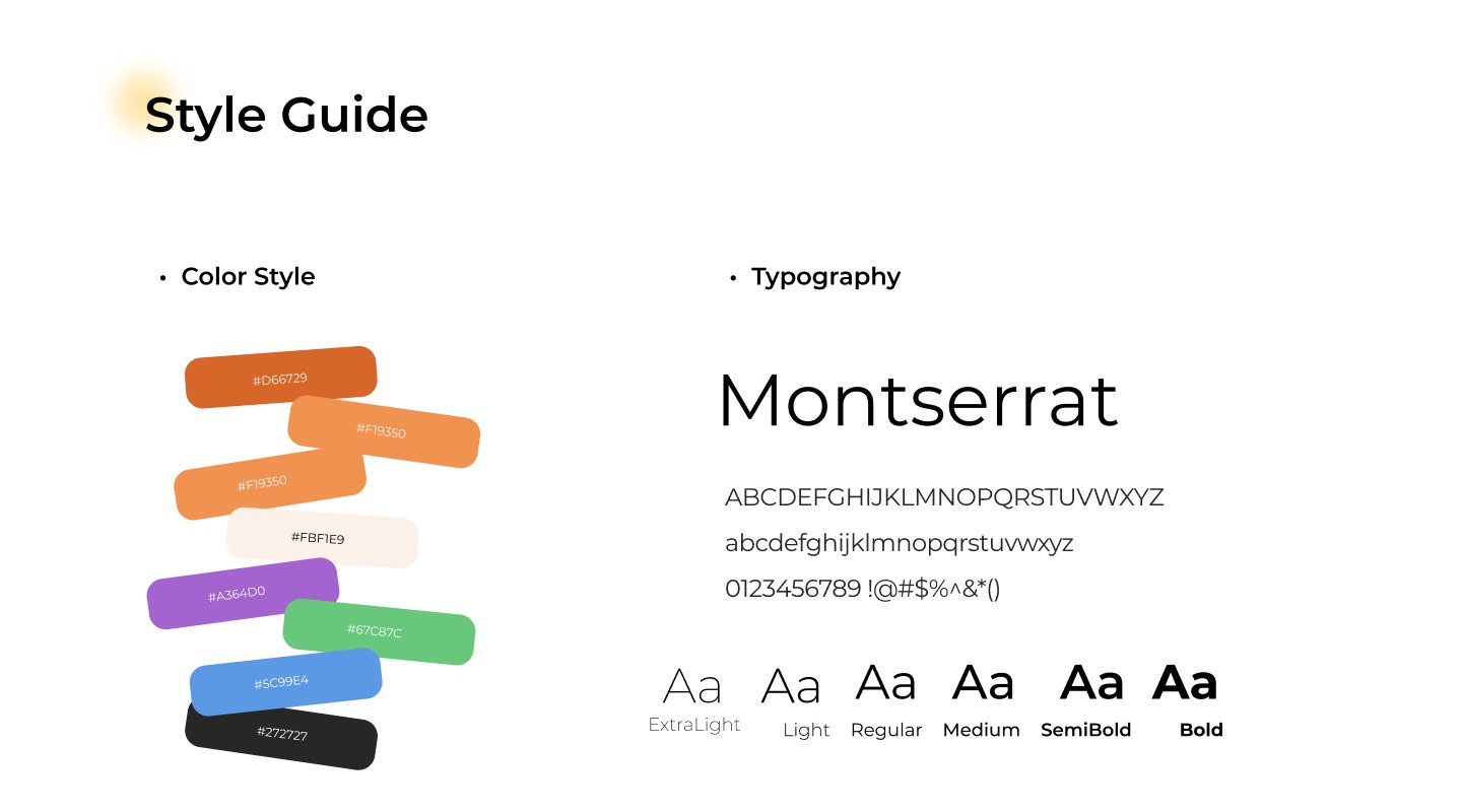
A Montserrat type scale, an orange primary palette with secondary accents, and illustrations created with Replit AI.
Click through the real flows. It runs right here in the page.
Run moderated sessions on onboarding, the health record and vet booking, the three flows that carry the most anxiety.
Vet booking is designed to take under 3 taps. That is a design target, to be measured in testing.
The journey map points to voice or photo (OCR) logging to reduce manual entry. It isn’t designed yet.